SpongeBob SquarePants 25th Anniversary
Visual Identity
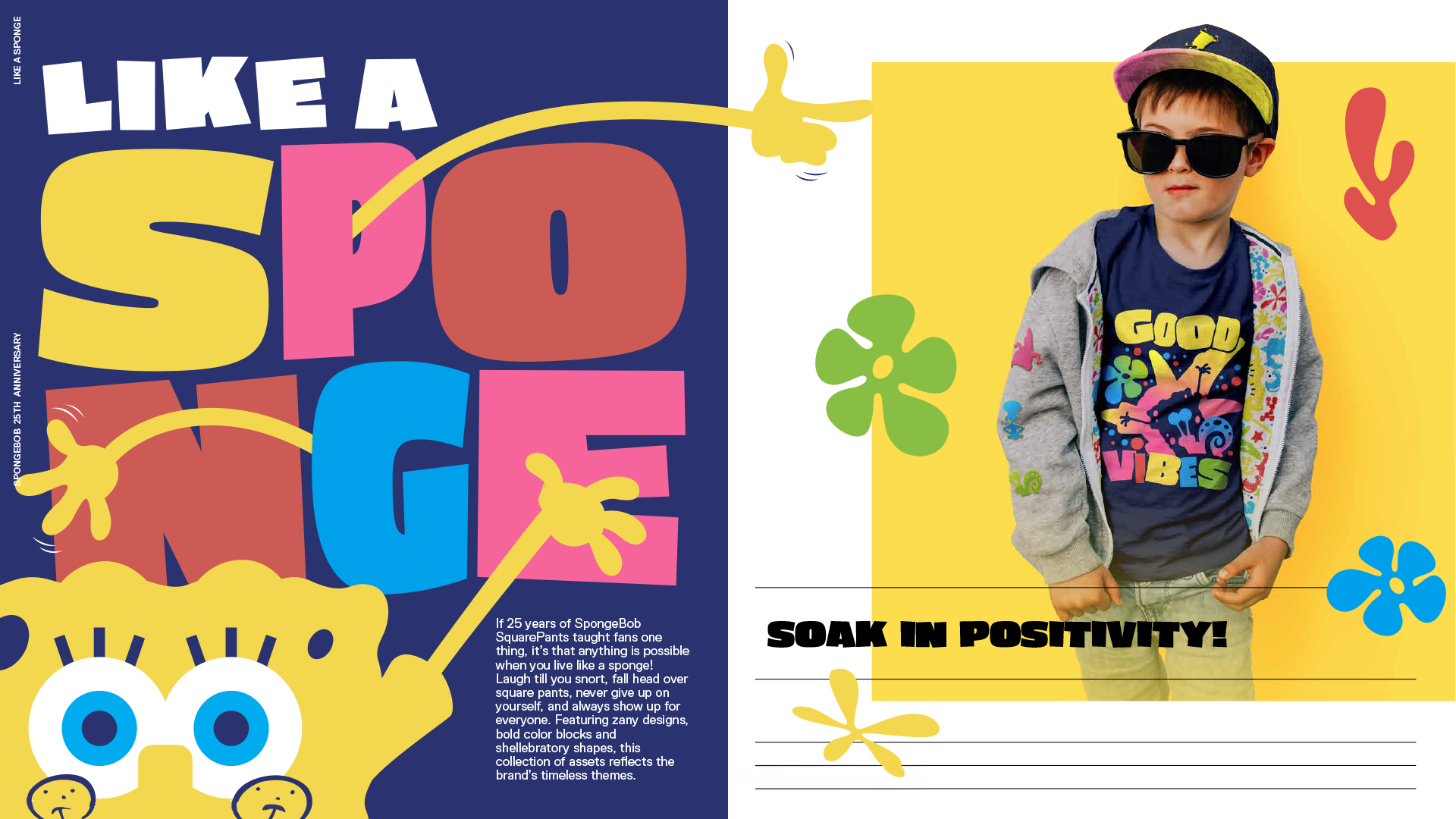
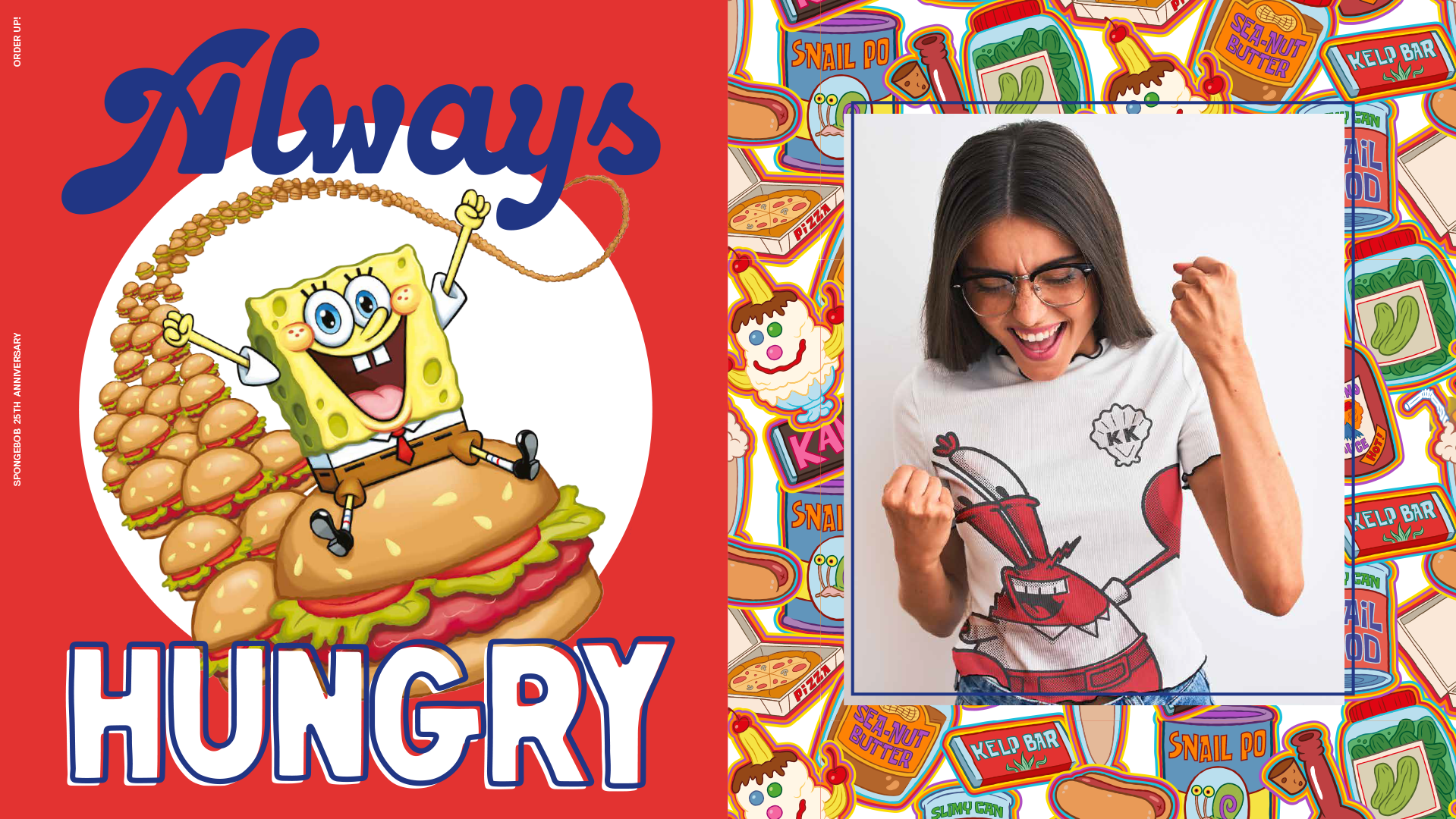
To celebrate 25 years of SpongeBob SquarePants, I helped lead the creative development of the anniversary campaign, a bold and kinetic visual system rooted in SpongeBob’s legacy of absurd optimism, pop culture resonance, and zany joy.
Working closely with Nickelodeon and Paramount’s global brand team, I designed a modular, asset-rich identity system that expanded across packaging, fashion, retail displays, digital marketing, and consumer products.
Creative Direction & Design Highlights:
Built a modular brand language using abstract character silhouettes, wiggly typography, layered compositions, and energetic motion cues.
Designed more than 30 original graphics, including hero lockups, environmental patterns, product-ready illustrations, and color-block character composites.
Introduced a dynamic color palette and typographic system inspired by underwater surrealism, 90s pop art, and modern nostalgia.
Developed layout systems adaptable to screen printing, textile design, digital media, and physical merchandising.
Applications & Outcomes:
Used across apparel, retail displays, limited-edition product lines, and digital fan activations.
Positioned the brand as both nostalgic and trend-forward, appealing to multigenerational fans and introducing SpongeBob to new global audiences.
Provided a scalable, fresh framework for future licensing and creative rollouts.
Role: Art Director / Visual Designer
Client: Nickelodeon.