Dora the Explorer Reboot
Brand Identity & Visual Development
As part of Nickelodeon’s reboot of the iconic Dora the Explorer franchise, I was responsible for designing a fresh, cohesive brand identity system that bridges nostalgia with a contemporary visual language for today’s preschool audience.
Working closely with the Nickelodeon brand team, I developed a vibrant visual toolkit that supports Dora’s next chapter across digital, print, and broadcast touchpoints.
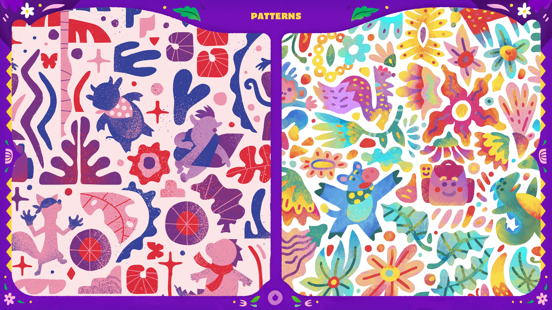
Created a modular visual system of background environments, iconography, and supporting assets
Developed motion studies and animated elements for use in promos, interstitials, and online marketing
Refined Dora’s color palette and typography system to reflect both legacy and modern accessibility
Delivered branded assets for packaging, streaming interfaces, and on-air graphics
The new Dora identity celebrates her adventurous spirit while simplifying shapes and textures for digital-first use. The system is flexible — designed to adapt across product lines, licensing materials, and broadcast content, while maintaining consistency and clarity.
Role: Art Director / Visual Designer
Client: Nickelodeon.